Choosing The Right Chart Type in Forex Trading
One thing that most forex traders have in common, and that sometimes separates us from stock traders, is how much we love to study charts. A price chart of a currency pair can reveal so much information about a market and even help us better understand the sentiment of the participants in the market, and what they are thinking.
Four chart types and how to use them
With charts being so important, I wanted to use this article to introduce a few different charts types and explain how each of them may help you see things from a different perspective.
1. Japanese candlestick charts
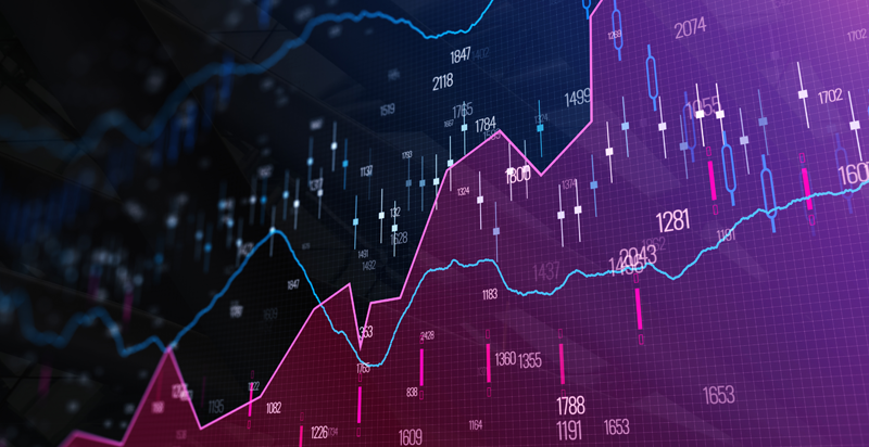
The Japanese candlestick chart is the most common chart type, and most traders are already familiar with it. The reason for its popularity is probably because of all the data that is represented visually in just a single bar on the chart; open price, high price, low price, and closing price.
With each bar on a Japanese candlestick chart containing so much information, some people have even developed trading strategies based on the bars alone.
On this chart, a red candle means that the closing price for the chosen time period is lower than the opening price, while green candles mean that the closing price is higher than the opening price.

As implied by its name, these charts were developed by Japanese traders all the way back in the 18thcentury. Originally used to trade rice futures on one of the earliest financial markets we know of, these charts are now popular across all markets, including forex, stocks, commodities, and cryptocurrencies. The chart is great for both all-round trading and technical analysis.
2. Open-high-low-close (OHLC) charts
The OHLC chart is a lesser known chart type often used by traders to do technical analysis of static charts, as they don’t work very well for live trading.

The chart represents the same information as the Japanese candlestick chart, but in a bit of a different way. In this chart, the “body” of each bar represent the distance between the lowest and the highest price during the given time period, while the short horizontal lines sticking out on the sides represent the opening and closing prices for each time period.
3. Line charts
This is the simplest and most straightforward of them all, and it is the type of chart you will most often see in the newspaper or on TV when people are talking about the stock market. However, the line chart still has some very good use cases even for more advanced traders that few people know about.

As opposed to the previous two charts that both represent four price data points in each bar, line charts only represent the closing price for each time period chosen. This means that when we use this chart, we will not know anything about how the price moved within that time period. It is therefore only useful for traders in a few very specific situations.
One such use case is when a trader is looking for chart patterns. Line charts can offer a lot more clarity than a candlestick chart can, simply because it removes a lot of “noise” from the charts. For example, it is an excellent tool to use when looking for things like head & shoulders, double tops and bottoms, or ABC patterns.
4. Renko charts
Also developed by Japanese traders, the renko chart is probably the most distinct chart type among them all, with a look resembling something like an old-school Super Mario game.

The renko chart works like a filter that removes all the smaller price movements and instead only displays the larger trends in the market. It is different from all the other chart types in that each bar on the renko chart represents a certain movement in price rather than a time period.
How large of a price movement that is needed before a new bar is printed on the chart varies, and the trader can usually adjust this in the settings on his charting software.
Renko charts can be great for spotting key support and resistance levels in a market, and it offers a level of clarity when it comes to price levels that few other charts can match. However, be aware that you are also missing out on other pieces of information when using this chart such as price consolidation areas.
Candlesticks still works for most uses
As an all-round trader, you will probably find that the Japanese candlestick chart is your best friend among charts. The amount of information it represents combined with the convenience of using it makes it a great choice most of the time.
However, line charts are still hard to beat when looking for chart patterns to trade, while renko charts can offer unparalleled clarity when you are trying to identity the main support and resistance levels in a given market.
If you’d like to have all the information given here condensed into a single fact sheet, go ahead and download our Charting Fact Sheet in PDF format.


")


